Updated October 4, 2018
In this post, we’ll look at how to make effective heatmaps using ezplot. We’ll
use a dataset of NBA players’ statistics from flowingdata.com. Make sure you
first install ezplot by running the command devtools::install_github("gmlang/ezplot").
library(ezplot)
library(dplyr)
library(tidyr)
Let’s get the data. Notice we pass the url directly to read.csv().
nba = read.csv("http://datasets.flowingdata.com/ppg2008.csv")
# examine the variables
str(nba)
## 'data.frame': 50 obs. of 21 variables:
## $ Name: Factor w/ 50 levels "Al Harrington ",..: 21 31 29 19 15 27 28 2 13 9 ...
## $ G : int 79 81 82 81 67 74 51 50 78 66 ...
## $ MIN : num 38.6 37.7 36.2 37.7 36.2 39 38.2 36.6 38.5 34.5 ...
## $ PTS : num 30.2 28.4 26.8 25.9 25.8 25.3 24.6 23.1 22.8 22.8 ...
## $ FGM : num 10.8 9.7 9.8 9.6 8.5 8.9 6.7 9.7 8.1 8.1 ...
## $ FGA : num 22 19.9 20.9 20 19.1 18.8 15.9 19.5 16.1 18.3 ...
## $ FGP : num 0.491 0.489 0.467 0.479 0.447 0.476 0.42 0.497 0.503 0.443 ...
## $ FTM : num 7.5 7.3 5.9 6 6 6.1 9 3.7 5.8 5.6 ...
## $ FTA : num 9.8 9.4 6.9 6.7 6.9 7.1 10.3 5 6.7 7.1 ...
## $ FTP : num 0.765 0.78 0.856 0.89 0.878 0.863 0.867 0.738 0.868 0.793 ...
## $ X3PM: num 1.1 1.6 1.4 0.8 2.7 1.3 2.3 0 0.8 1 ...
## $ X3PA: num 3.5 4.7 4.1 2.1 6.7 3.1 5.4 0.1 2.3 2.6 ...
## $ X3PP: num 0.317 0.344 0.351 0.359 0.404 0.422 0.415 0 0.364 0.371 ...
## $ ORB : num 1.1 1.3 1.1 1.1 0.7 1 0.6 3.4 0.9 1.6 ...
## $ DRB : num 3.9 6.3 4.1 7.3 4.4 5.5 3 7.5 4.7 5.2 ...
## $ TRB : num 5 7.6 5.2 8.4 5.1 6.5 3.6 11 5.5 6.8 ...
## $ AST : num 7.5 7.2 4.9 2.4 2.7 2.8 2.7 1.6 11 3.4 ...
## $ STL : num 2.2 1.7 1.5 0.8 1 1.3 1.2 0.8 2.8 1.1 ...
## $ BLK : num 1.3 1.1 0.5 0.8 1.4 0.7 0.2 1.7 0.1 0.4 ...
## $ TO : num 3.4 3 2.6 1.9 2.5 3 2.9 1.8 3 3 ...
## $ PF : num 2.3 1.7 2.3 2.2 3.1 1.8 2.3 2.8 2.7 3 ...# look at the first 5 rows and 8 columns
nba[1:5, 1:8]## Name G MIN PTS FGM FGA FGP FTM
## 1 Dwyane Wade 79 38.6 30.2 10.8 22.0 0.491 7.5
## 2 LeBron James 81 37.7 28.4 9.7 19.9 0.489 7.3
## 3 Kobe Bryant 82 36.2 26.8 9.8 20.9 0.467 5.9
## 4 Dirk Nowitzki 81 37.7 25.9 9.6 20.0 0.479 6.0
## 5 Danny Granger 67 36.2 25.8 8.5 19.1 0.447 6.0The variable Name has the names of the NBA players. By default, it’s treated
by R as a Factor with levels ordered alphabetically. Reorder its levels by
points scored.
nba$Name = with(nba, reorder(Name, PTS))The other variables are various performance statistics. Before we can make a heat map, we need to put the data in the long format. In other words, we need to gather the names of the statistics in one column, and their values in another column.
nba_m = nba %>% gather(stats, val, -Name)
head(nba_m)
## Name stats val
## 1 Dwyane Wade G 79
## 2 LeBron James G 81
## 3 Kobe Bryant G 82
## 4 Dirk Nowitzki G 81
## 5 Danny Granger G 67
## 6 Kevin Durant G 74We also want to scale the values of each performance statistics so that they are between 0 and 1.
dat = nba_m %>% group_by(stats) %>% mutate(val_scaled = scales::rescale(val))
head(dat)
## # A tibble: 6 x 4
## # Groups: stats [1]
## Name stats val val_scaled
## <fct> <chr> <dbl> <dbl>
## 1 "Dwyane Wade " G 79 0.947
## 2 "LeBron James " G 81 0.982
## 3 "Kobe Bryant " G 82 1
## 4 "Dirk Nowitzki " G 81 0.982
## 5 "Danny Granger " G 67 0.737
## 6 "Kevin Durant " G 74 0.860With all these data prep work done, we’re ready to make a heatmap. This is super easy with ezplot.
plt = mk_heatmap(dat)
p = plt("stats", "Name", "val_scaled")
rotate_axis_text(p, 90, vjust_x = 0.5)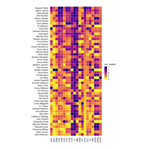
Not it’s your turn. Make a heat map using the unscaled values, and compare it with the scaled version. You will see they are very different. The scaled version is the mathematically correct one.
This is the last post in the ezplot how-to series. If you’ve enjoyed it, tell your friend about it. If you want to learn more about how to use ezplot, you can get my book here.