When doing descriptive analysis, we often want to see how each variable is distributed. For a continuous variable, this means we want to plot its histogram and check its normality (checking normality of the response variable is necessary when you plan to use linear regression in your inference or predictive analysis). Here’re two small functions that allow you to do that on the fly. They don’t give you dazzling plots for final presentation, however, they do give you informative plots that allow you to see if a variable needs any transformation.
plot_hist = function(x, xlabel) {
        ## @x: a numeric vector
        ## @xlabel: a string

        # draw histogram
        hist(x, main = mtext(bquote(
                paste(bolditalic("median") == .(round(median(x),1)), " (",
                      bolditalic("mean") == .(round(mean(x),1)), ")")
                )), xlab = xlabel, xlim=range(x), prob=TRUE)

        # add a rug to histogram
        rug(x)

        # draw red vertical line at median
        abline(v = median(x), col = "red", lwd=2)

        # draw density curve over the histogram
	lines(density(x))
}

check_normality = function(x) {
	qqnorm(x, pch=19)
	qqline(x, col=2)
}
Here’s a demo plot by plot_hist():
data(mtcars)
plot_hist(mtcars$hp, "horse power")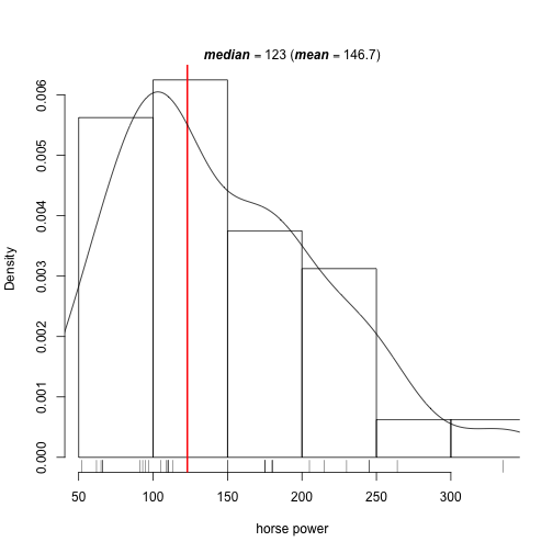
In this case, horse power is right skewed. As we can see, plot_hist() overlays a density plot on top of the histogram and draws a red vertical line at the median. I found adding these two things is much more helpful than the default histogram generated by hist().
Here’s a demo plot by check_normality():
check_normality(mtcars$hp)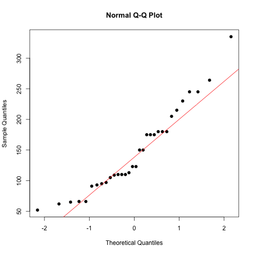
It confirms horse power is not normal. To make it approximately normal, we may do a log transformation since it’s right skewed.