Updated October 4, 2018
Do you love ggplot2? If you’ve worked with ggplot2 before, you know
it often takes many lines of code to get a satisfying plot. The ggplot2 language has too many “words” and “expressions”, which are difficult to remember and time consuming to look up. Wouldn’t it be awesome if there’s a simpler tool? The answer is ezplot. It’s a package based off ggplot2 that allows user to create high quality ggplot2 charts with zero or minimal effort of customization. In this and the next few posts, I’ll demo how to use ezplot.
Prerequisites
- Install a set of development tools
- On Windows, download and install Rtools.
- On Mac, install the Xcode command line tools.
- On Linux, install the R development package, usually called r-devel or r-base-dev.
- Install devtools by running
install.packages("devtools")in R. - Install ezplot by running
devtools::install_github("gmlang/ezplot")in R.
Load ezplot and dplyr
library(ezplot)
library(dplyr)
Generate some fake data
df = read.table(header=TRUE, text='
student grade
Joe 90
Mary 75
Alex 50')
df$pct = df$grade / sum(df$grade)
print(df)
## student grade pct
## 1 Joe 90 0.4186047
## 2 Mary 75 0.3488372
## 3 Alex 50 0.2325581Make simple bar chart
plt = mk_barplot_resp(df)
plt("student", "grade", label_decimals = 0) 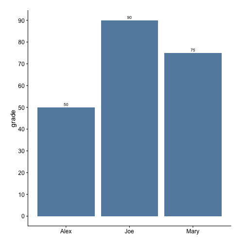
plt("student", "pct", show_pct = T) 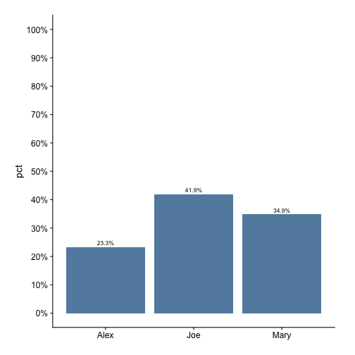
Generate some fake data again
df2 = read.table(header=TRUE, text='
group level val
A      small 1.8
A      medium 2.2
A      large 1.5
B      small 2.0
B      medium 2.6
B      large 1.0
C      small 2.5
C      medium 1.3
C      large 2.9')
Make dodged bar chart
# plot val
plt = mk_barplot_resp(df2)
plt("group", "val", fillby = "level") 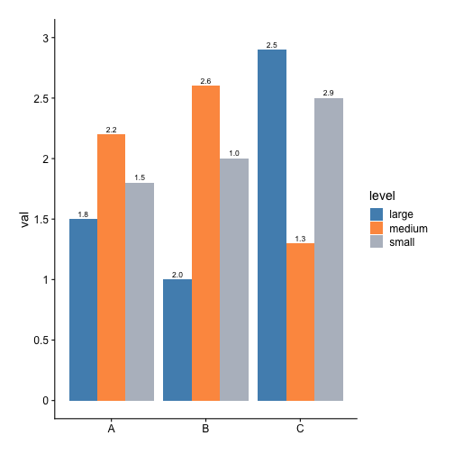
# calc pct of val of each level within each group
dat = df2 %>% group_by(group) %>% mutate(pct = val / sum(val))

# plot pct
plt = mk_barplot_resp(dat)
plt("group", "pct", fillby = "level", show_pct = T)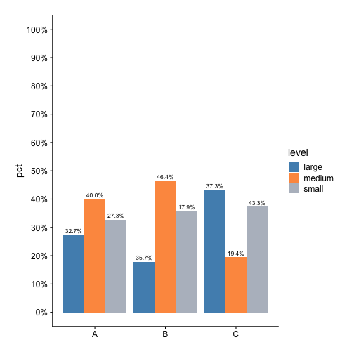
I wrote ezplot to improve efficiency. Hope it can also help you. Drop a comment below if you have any questions.
