Updated October 4, 2018
Previously, I gave examples of ezplot barcharts and boxplots. In today’s post, I’ll discuss two common charts for displaying distributions of numeric variables, namely, the histogram and the density plot. By the end of this article, you’ll know how to make sophisticated histograms and density plots using ezplot. And once again, you’ll be amazed how simple it is. Let’s get started.
Load ezplot
Make sure you first install ezplot by running the command devtools::install_github("gmlang/ezplot").
library(ezplot)
library(dplyr)
Histogram
First, we pass the iris data frame into the function mk_histogram() to get a plotting function that for drawing histograms of any numeric variables in iris.
plt = mk_histogram(iris)If you haven’t noticed, all the mk_xxx() functions in ezplot takes one and only one argument, namely, a data frame. They all return plotting functions that take names of variables from the data frame as input. This design came from the simple idea that functions can return functions.
Let’s draw a histogram for Sepal.Length.
plt("Sepal.Length")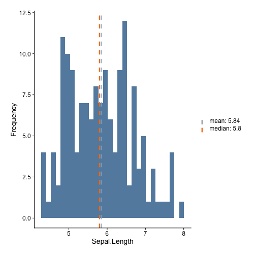
# adjust bin width
plt("Sepal.Length", binw = 0.2)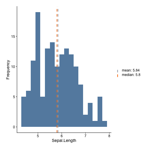
# remove the vertical line at the mean
plt("Sepal.Length", add_vline_mean = F)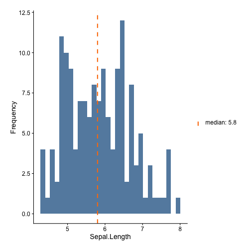
Density plots
Density plots and histograms are twins. They show the same information. In ezplot, we use
the mk_densityplot() function to make density plots. For example, let’s make a density plot for Sepal.Length.
plt = mk_densityplot(iris)
plt("Sepal.Length")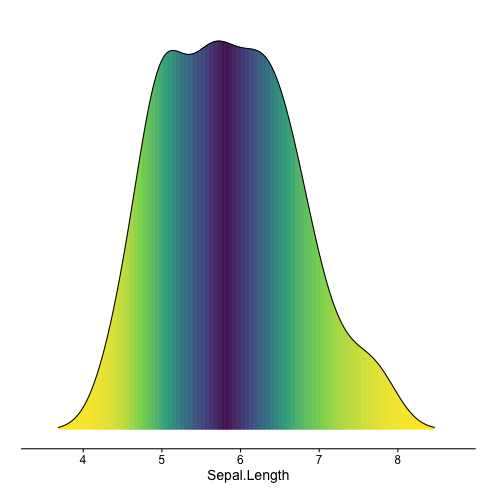
# don't remove tails
plt("Sepal.Length", cut_tail = 0)
The iris data has a variable called “Species”. Wouldn’t it be nice if we can see how Sepal Length is distributed across different Species? This is super easy to do with ezplot.
plt("Sepal.Length", yvar = "Species")## Picking joint bandwidth of 0.181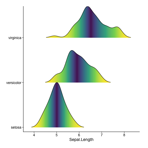
I made ezplot out of the frustration that there are too many details to remember when customizing a ggplot. It has greatly improved my productivity. Please drop a comment below if you have questions.
