Updated October 4, 2018
Previously, I showed how to use the mk_barplot_resp() function to make bar charts.
In this post, I’ll show you how to use the mk_barplot_freq() function.
Make sure you first install ezplot by running the command devtools::install_github("gmlang/ezplot").
library(ezplot)
library(dplyr)
We’ll use the diamonds data in the ggplot2 package.
plt = mk_barplot_freq(ggplot2::diamonds)Let’s make a bar chart to show the frequency distribution of the clarities. Notice the bars are automatically labeled with both counts and percents.
plt("clarity")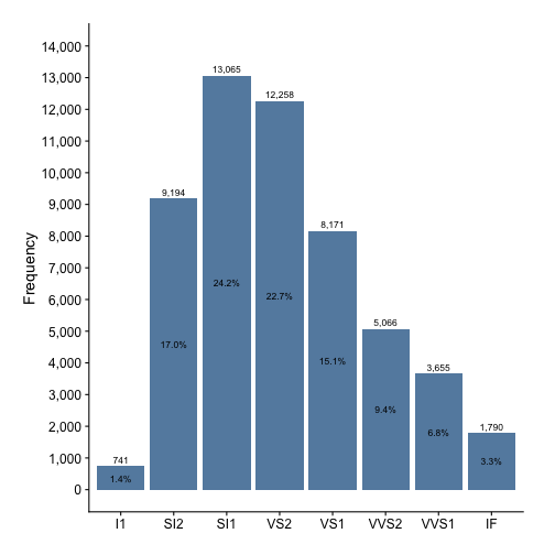
We can also choose to show relative frequencies (%) on the y-axis. Just set
show_pct = TRUE
plt("clarity", show_pct = TRUE)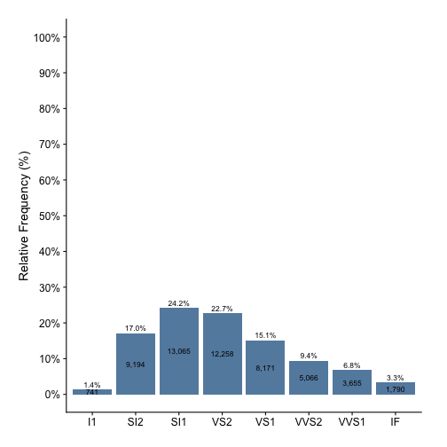
If ezplot has improved your productivity, please share it with your friends.