Updated October 4, 2018
In an earlier post, I showed you how easy it is to make high quality histograms and boxplots using ezplot. When we’re analyzing a continuous variable, we often want to check if it’s normally distributed. Q-Q plot is a good tool to do that.
Make sure you first install ezplot by running the command devtools::install_github("gmlang/ezplot").
library(ezplot)
library(dplyr)
We’ll use the cars dataset, which comes with the base R distribution. It has
two variables, speed and dist. Both are continuous. Let’s first create a
normal Q-Q plot for dist.
plt = mk_qqplot(cars)
p = plt("dist", detrend = F)
square_fig(p)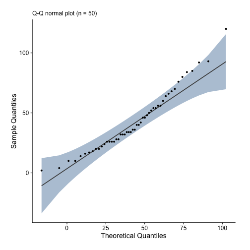
We see dist is approximately normal because most of the data points are aligned
linearly along the 45 degree diagonal line and within the confidence band. Next,
we make a detrended normal Q-Q plot for speed and observe it’s also
normally distributed because all data points are randomly scattered around
$y = 0$ and within the confidence band.
plt("speed")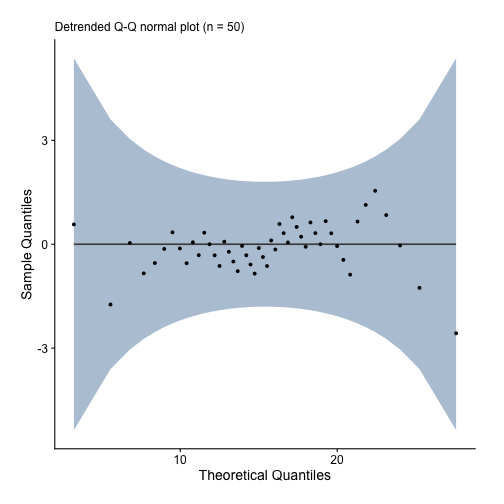
If you liked these how-to blog posts, you may want to check out my ezplot book.