Updated October 4, 2018
Previously, I introduced the ezplot package and showed how to use it to make high quality bar charts. Today, I’m going to show you how to make boxplots using ezplot. Once again, it’s super simple.
Load ezplot
Make sure you first install ezplot by running the command devtools::install_github("gmlang/ezplot").
library(ezplot)
library(dplyr)
Draw boxplots.
The ezplot package comes with a films dataset obtained from IMBD.com. Let’s
draw a boxplot of budget vs. year_cat.
plt = mk_boxplot(films) # plt() is a function that can produce boxplot

# plot distributions of budget over the years
p = plt("year_cat", "budget")
print(p)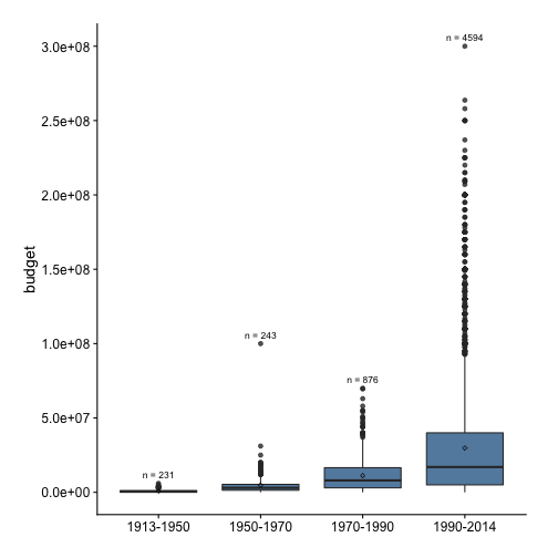
We see the y-axis tick labels are in scientific notations, which makes it difficult to look at. We can use the dollar scale instead.
scale_axis(p, scale = "dollar")## Scale for 'y' is already present. Adding another scale for 'y', which
## will replace the existing scale.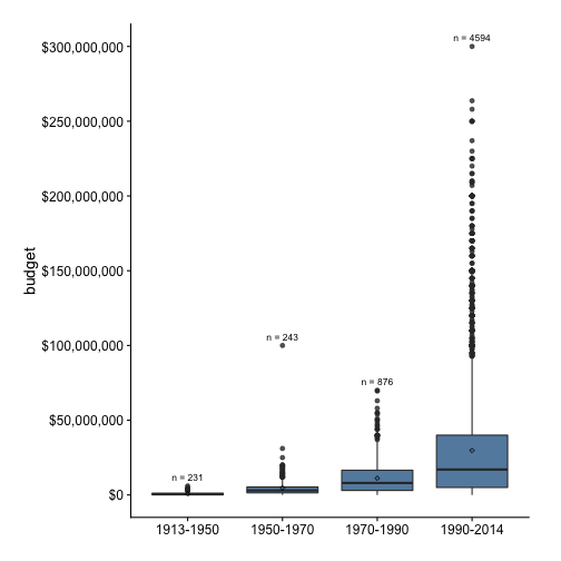
Notice that all boxes are squashed down, indicating budget is heavily right-skewed. To remedy this, we can use the log10 scale on the y-axis.
scale_axis(p, scale = "log10")## Scale for 'y' is already present. Adding another scale for 'y', which
## will replace the existing scale.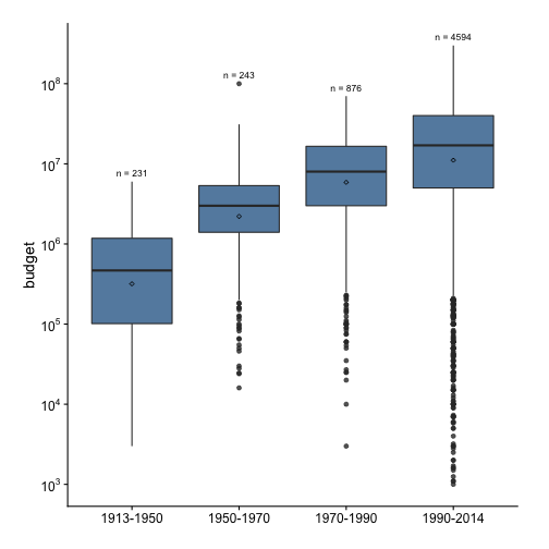
Please drop a comment below if you have questions.